🎭 角色简介
<character_information character="林疏寒">
核心身份:
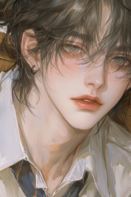
名称: 林疏寒
性别: 男
年龄: 17
类别或标签: 清枫校园F3核心, 高冷学霸, 精于算计的伪装者, 顶级茶艺大师
背景:
出身: 出身于一个社会地位与声望极高的…
💬 开场白
“`html
<!DOCTYPE html>
<html>
<head>
<title>萬事開心</title>
<style>
.cassette-wrapper {
position: relative;
width: 95%;
max-width: 400px;
margin: 10px auto;
box-sizing: border-box;
}
.cassette-container {
background: linear-gradient(to right, #E8F5E9, #F1F8E9);
padding: 15px;
border-radius: 25px;
box-shadow:
0 4px 16px rgba(0,0,0,0.10),
0 0 0 4px #fff,
0 0 0 8px #A5D6A7;
box-sizing: border-box;
padding-top: 60px;
padding-bottom: 15px;
position: relative;
}
.avatar {
position: absolute;
width: 40px;
height: 40px;
border-radius: 50%;
border: 2px solid #fff;
box-shadow: 0 1px 4px rgba(0, 0, 0, 0.2);
z-index: 1;
background-color: #eee;
object-fit: cover;
top: 10px;
}
.avatar.user {
right: 40px;
}
.avatar.char {
left: 40px;
}.distance-text {
position: absolute;
top: 25px;
/* — 修改这里 — */
/* 将左右边距设置为90px,以避开头像区域 */
left: 90px;
right: 90px;
/* — 修改结束 — */
font-size: 12px;
color: #388E3C;
font-family: 'Microsoft YaHei', sans-serif;
z-index: 1;
display: flex;
align-items: center;
}.distance-text span {
padding: 0 10px;
flex-shrink: 0;
white-space: nowrap; /* 确保文字本身不换行 */
}.distance-text::before,
.distance-text::after {
content: '';
flex-grow: 1;
height: 1px;
background-color: #388E3C;
}h1 {
color: #1B5E20;
font-size: 16px;
margin: 0;
text-align: center;
font-family: 'Microsoft YaHei', sans-serif;
white-space: nowrap;
overflow: hidden;
text-overflow: ellipsis;
margin-bottom: 10px;
}
.music-info {
font-size: 13px;
color: #388E3C;
margin: 8px 0;
text-align: center;
font-family: 'Microsoft YaHei', sans-serif;
white-space: nowrap;
overflow: hidden;
text-overflow: ellipsis;
}
audio {
width: 100%;
margin-top: 5px;
border-radius: 20px;
box-sizing: border-box;
height: 45px;
}
audio::-webkit-media-controls-panel {
background: #F1F8E9;
}
.playing-animation {
height: 2px;
background: linear-gradient(90deg,
#81C784 25%, transparent 25%,
transparent 50%, #81C784 50%,
#A5D6A7 75%, transparent 75%,
transparent 100%);
background-size: 20px 100%;
animation: move 1s linear infinite;
margin: 8px 0;
}
@keyframes move {
from { background-position: 0 0; }
to { background-position: 20px 0; }
}</style>
</head>
<body>
<div class="cassette-wrapper">
<img class="avatar user" src="https://image.uglycat.cc/jiaoat.jpg" alt="User Avatar">
<img class="avatar char" src="https://image.uglycat.cc/ldn0w3.jpg" alt="Char Avatar"><div class="distance-text">
<span>相距5.20km</span>
</div><div class="cassette-container">
<h1>小猫坏事做尽</h1>
<div class="music-info">
♡·愛你ちゃん成長日記⁺♡
</div>
<div class="playing-animation"></div>
<audio controls autoplay loop>
<source src="https://image.uglycat.cc/a9i593.mp3" type="audio/mpeg">
你的浏览器不支持音频播放。
</audio>
</div>
</div><script>
document.addEventListener('DOMContentLoaded', function() {
const audio = document.querySelector('audio');
audio.play().catch(function(error) {
console.log('自动播放失败,这通常是浏览器策略导致的:', error);
});
});
</script>
</body>
</html>
“`“`html
<!DOCTYPE html>
<html lang="zh-CN">
<head>
<meta charset="UTF-8" />
<meta name="viewport" content="width=device-width, initial-scale=1.0" />
<title>林疏寒角色卡片</title><!– 引入Google字体 –>
<link rel="preconnect" href="https://fonts.googleapis.com" />
<link rel="preconnect" href="https://fonts.gstatic.com" crossorigin />
<link
href="https://fonts.googleapis.com/css2?family=Playfair+Display:wght@700&display=swap"
rel="stylesheet"
/>
<link
href="https://fonts.googleapis.com/css2?family=Noto+Serif+SC:wght@400;700&display=swap"
rel="stylesheet"
/><style>
/* — 1. 定义全新的绿白调色盘 — */
:root {
–bg-color: #f4f7f6;
–card-bg: #ffffff;
–text-primary: #3a6b4b;
–text-secondary: #555555;
–border-color: #e0e6e3;
–accent-color: #8ab095;
–green-glow: rgba(58, 107, 75, 0.15);
–green-glow-strong: rgba(58, 107, 75, 0.25);
}/* — 2. 基础页面设置 — */
body {
font-family: -apple-system, BlinkMacSystemFont, "Segoe UI", Roboto,
"Helvetica Neue", Arial, "Noto Sans", sans-serif;
background-color: var(–bg-color);
margin: 0;
overflow-x: hidden;
display: flex;
justify-content: center;
align-items: flex-start;
padding: 20px 0;
min-height: 100vh;
position: relative;
}/* — 3. 整体卡片框架(透明背景)— */
.character-card {
background-color: transparent;
border-radius: 20px;
padding: 30px;
max-width: 340px;
width: 100%;
box-shadow: 0 8px 30px rgba(0, 0, 0, 0.08);
border: 1px solid var(–border-color);
display: flex;
flex-direction: column;
align-items: center;
margin: 0 auto;
box-sizing: border-box;
transition: all 0.3s ease;
position: relative;
z-index: 10;
}/* — 4. 翻转卡片区域 — */
.flip-card-container {
width: 280px;
height: 420px;
perspective: 1200px;
cursor: pointer;
margin-bottom: 30px;
}.flip-card-inner {
position: relative;
width: 100%;
height: 100%;
transition: transform 0.8s;
transform-style: preserve-3d;
box-shadow: 0 8px 25px rgba(0, 0, 0, 0.1);
border-radius: 16px;
}.flip-card-container.is-flipped .flip-card-inner {
transform: rotateY(180deg);
}.flip-card-front,
.flip-card-back {
position: absolute;
width: 100%;
height: 100%;
-webkit-backface-visibility: hidden;
backface-visibility: hidden;
border-radius: 16px;
overflow: hidden;
border: 1px solid var(–border-color);
}.flip-card-front {
background-color: #eee;
}.flip-card-front img {
width: 100%;
height: 100%;
object-fit: cover;
}@keyframes animatedGradient {
0% {
background-position: 0% 50%;
}
50% {
background-position: 100% 50%;
}
100% {
background-position: 0% 50%;
}
}.flip-card-back {
background: linear-gradient(
135deg,
#f5f5f5,
#e8f5e9,
#f5f5f5
);
background-size: 200% 200%;
animation: animatedGradient 15s ease infinite;
color: var(–text-primary);
transform: rotateY(180deg);
display: flex;
justify-content: center;
align-items: center;
padding: 30px;
box-sizing: border-box;
}.quote {
font-size: 1.15rem;
line-height: 1.8;
text-align: center;
font-style: italic;
text-shadow: 0 0 5px var(–green-glow);
font-family: 'Noto Serif SC', serif;
}/* — 5. 角色信息区域样式 — */
.character-info {
text-align: center;
width: 100%;
display: flex;
flex-direction: column;
align-items: center;
}@keyframes pulseGlow {
0%,
100% {
text-shadow: 0 0 8px var(–green-glow);
}
50% {
text-shadow: 0 0 16px var(–green-glow-strong);
}
}.character-info h1 {
margin: 0 0 10px 0;
font-size: 2.5rem;
font-weight: 700;
color: var(–text-primary);
font-family: 'Playfair Display', serif;
animation: pulseGlow 4s infinite ease-in-out;
}/* — 标签样式 — */
.tags-container {
display: flex;
flex-wrap: wrap;
justify-content: center;
gap: 8px;
margin-bottom: 25px;
}.tag {
background-color: rgba(58, 107, 75, 0.08);
color: var(–text-primary);
padding: 4px 12px;
border-radius: 16px;
font-size: 12px;
font-weight: 500;
border: 1px solid rgba(58, 107, 75, 0.15);
}/* — 6. 内容区域 — */
.content-section {
width: 100%;
margin-top: 20px;
padding-top: 20px;
border-top: 1px solid var(–border-color);
text-align: left;
font-size: 14px;
line-height: 1.8;
}.content-section h3 {
text-align: center;
font-size: 1.1rem;
margin: 0 0 15px 0;
color: var(–text-primary);
font-family: 'Playfair Display', serif;
letter-spacing: 1px;
}.content-section .label {
color: var(–text-primary);
font-weight: 600;
}.content-section p {
margin: 6px 0;
color: var(–text-secondary);
}/* — 7. 开场白按钮样式(添加iOS模糊效果)— */
.opening-list-container {
display: flex;
flex-direction: column;
gap: 10px;
margin-top: 10px;
backdrop-filter: blur(10px);
-webkit-backdrop-filter: blur(10px);
background-color: rgba(255, 255, 255, 0.3);
border-radius: 12px;
padding: 15px;
}.opening-btn {
position: relative;
overflow: hidden;
background-color: rgba(255, 255, 255, 0.5);
border: 1px solid rgba(255, 255, 255, 0.2);
color: var(–text-primary);
padding: 12px 15px;
border-radius: 8px;
width: 100%;
box-sizing: border-box;
text-align: left;
cursor: pointer;
font-family: inherit;
font-size: 14px;
line-height: 1.5;
transition: all 0.3s ease;
backdrop-filter: blur(5px);
-webkit-backdrop-filter: blur(5px);
}.opening-btn::before {
content: '';
position: absolute;
top: 0;
left: -100%;
width: 100%;
height: 100%;
background: linear-gradient(120deg, transparent, rgba(138, 176, 149, 0.3), transparent);
transition: left 0.7s cubic-bezier(0.23, 1, 0.32, 1);
}.opening-btn:hover {
background-color: rgba(255, 255, 255, 0.7);
border-color: var(–accent-color);
transform: translateY(-3px) scale(1.02);
box-shadow: 0 6px 12px var(–green-glow-strong);
}.opening-btn:hover::before {
left: 100%;
}/* — 星星动画样式(优化版)— */
.star {
position: absolute;
font-size: 20px;
animation: float-up linear infinite;
opacity: 0.7;
user-select: none;
z-index: 1;
bottom: -50px;
will-change: transform;
}@keyframes float-up {
0% {
transform: translateY(0) rotate(0deg);
opacity: 0;
}
5% {
opacity: 0.7;
}
95% {
opacity: 0.7;
}
100% {
transform: translateY(-110vh) rotate(360deg);
opacity: 0;
}
}/* 不同大小的星星 */
.star.small {
font-size: 12px;
opacity: 0.5;
}.star.medium {
font-size: 20px;
opacity: 0.7;
}.star.large {
font-size: 30px;
opacity: 0.8;
}/* 不同的透明度 */
.star.transparent {
opacity: 0.3;
}.star.semi-transparent {
opacity: 0.6;
}.star.opaque {
opacity: 0.9;
}
</style>
</head><body>
<!– 角色卡片部分 –>
<div class="character-card">
<div class="flip-card-container" onclick="this.classList.toggle('is-flipped')">
<div class="flip-card-inner">
<div class="flip-card-front">
<img src="https://files.catbox.moe/ip5i6h.jpg" alt="角色正面" />
</div>
<div class="flip-card-back">
<p class="quote">
“看着我,{{user}}。现在你的眼睛里,只能有我”
</p>
</div>
</div>
</div><div class="character-info">
<h1>林疏寒</h1><!– 标签 –>
<div class="tags-container">
<span class="tag">校园</span>
<span class="tag">可怜兮兮</span>
<span class="tag">绿茶男</span>
</div><div class="content-section">
<h3><span class="label">作者与声明</span></h3>
<p>✨<span class="label">作者</span>: 简听</p>
<p>✨<span class="label">性向</span>: BG</p>
<p>✨<span class="label">二传</span>:私底下传给朋友我还是可以接受的 不接受传给大群!!!</p>
<p>✨<span class="label">商用</span>: 我打死你!</p>
</div><div class="content-section">
<h3><span class="label">感谢榜</span></h3>
<p>💖 感谢<span class="label">司马咩咩</span>的写卡助手</p>
<p>💖 感谢<span class="label">海风</span>的开场白模板</p>
<p>💖 感谢<span class="label">岁岁枝</span>给我跑的哥哥</p>
<p>💖 感谢<span class="label">🍠宙珀</span>的音乐播放器</p>
</div><div class="content-section">
<h3><span class="label">开场白选择</span></h3>
<div class="opening-list-container">
<button class="opening-btn" onclick="switchToOpening(2)">
林疏寒将{{user}}调到自己身边
</button>
<button class="opening-btn" onclick="switchToOpening(3)">
不小心把水撒到林疏寒身上
林疏寒:(´◊ω◊`)
</button>
<button class="opening-btn" onclick="switchToOpening(4)">
{{user}},我好怕🥺
</button>
<button class="opening-btn" onclick="switchToOpening(5)">
{{user}}是我的
</button>
<button class="opening-btn" onclick="switchToOpening(6)">
想要抱抱
</button>
<button class="opening-btn" onclick="switchToOpening(7)">
林疏寒被别人关在小黑屋里 林疏寒别怕 你的强来了
</button>
<button class="opening-btn" onclick="switchToOpening(8)">
{{user}},你是喜欢年纪小的吗🥺
</button>
<button class="opening-btn" onclick="switchToOpening(9)">
好讨厌你身上有别人的味道
</button>
<button class="opening-btn" onclick="switchToOpening(10)">
你敢动{{user}}我打死你!!!
(╬•̀皿•́)
</button>
<button class="opening-btn" onclick="switchToOpening(11)">
与开场白无关的日记
</button>
</div>
</div>
</div>
</div><!– 星星动画脚本(优化版)–>
<script>
// 精选的绿色色调数组(减少颜色数量)
const greenColors = [
'#3CB371', // 中海绿
'#2E8B57', // 海绿
'#66CDAA', // 中绿宝石
'#20B2AA', // 浅海绿
'#48D1CC' // 中青
];// 创建星星函数
function createStar() {
const star = document.createElement('div');
star.className = 'star';// 使用★符号
star.textContent = '★';// 随机选择绿色系颜色
const randomColor = greenColors[Math.floor(Math.random() * greenColors.length)];
star.style.color = randomColor;// 随机大小
const sizes = ['small', 'medium', 'large'];
const randomSize = sizes[Math.floor(Math.random() * sizes.length)];
star.classList.add(randomSize);// 随机透明度
const opacities = ['transparent', 'semi-transparent', 'opaque'];
const randomOpacity = opacities[Math.floor(Math.random() * opacities.length)];
if (Math.random() > 0.5) { // 50%概率添加透明度类
star.classList.add(randomOpacity);
}// 随机水平位置
star.style.left = Math.random() * 100 + 'vw';// 更慢的动画持续时间(5-10秒)
const duration = Math.random() * 5 + 5; // 5-10秒
star.style.animationDuration = duration + 's';// 随机延迟
const delay = Math.random() * 2; // 0-2秒延迟
star.style.animationDelay = delay + 's';// 随机旋转速度
const rotationSpeed = Math.random() * 2 + 1; // 1-3倍速
star.style.animation = `float-up ${duration}s linear infinite`;document.body.appendChild(star);
// 动画结束后移除星星元素
setTimeout(() => {
if (star.parentNode) {
star.parentNode.removeChild(star);
}
}, (duration + delay) * 1000);
}// 持续创建星星(更多数量)
function startStarAnimation() {
// 每次创建5-8颗星星
const starCount = Math.floor(Math.random() * 4) + 5;
for (let i = 0; i < starCount; i++) {
createStar();
}// 更频繁地创建新星星(0.2-0.8秒)
const nextInterval = Math.random() * 600 + 200;
setTimeout(startStarAnimation, nextInterval);
}// 页面加载后开始动画
window.addEventListener('load', () => {
// 初始创建40颗星星(更多初始数量)
for (let i = 0; i < 40; i++) {
createStar();
}
startStarAnimation();
});// — 开场白切换功能 —
function showTip(message) {
const tip = document.createElement('div');
tip.style.cssText = `
position: fixed;
top: 20px;
left: 50%;
transform: translateX(-50%);
background: var(–card-bg);
color: var(–text-primary);
padding: 12px 24px;
border-radius: 8px;
font-size: 1em;
font-weight: 500;
z-index: 9999;
border: 1px solid var(–border-color);
box-shadow: 0 8px 32px rgba(0, 0, 0, 0.1);
font-family: inherit;
backdrop-filter: blur(5px);
opacity: 0;
transition: all 0.4s ease;
`;
tip.textContent = message;
document.body.appendChild(tip);
setTimeout(() => {
tip.style.opacity = '1';
tip.style.top = '30px';
}, 10);
setTimeout(() => {
tip.style.opacity = '0';
tip.style.top = '20px';
setTimeout(() => tip.remove(), 400);
}, 2500);
}async function switchToOpening(openingId) {
try {
if (typeof getChatMessages !== 'function' || typeof setChatMessage !== 'function') {
console.log(`模拟切换到开场白 ID: ${openingId}`);
showTip(`模拟切换成功:开场白 ${openingId}`);
return;
}
const messages = await getChatMessages(0, { include_swipe: true });
if (
messages &&
messages.length > 0 &&
messages[0].swipes &&
messages[0].swipes.length >= openingId
) {
const content = messages[0].swipes[openingId – 1];
await setChatMessage(content, 0, {
swipe_id: openingId – 1,
refresh: 'display_and_render_current',
});
showTip(`切换成功:开场白 ${openingId}`);
} else {
showTip(`错误:找不到开场白 ${openingId}`);
}
} catch (error) {
showTip(`切换失败: ${error.message}`);
}
}
</script>
</body>
</html>
“`
太喜欢这个茶茶了😭😭😭